Headless CMS > Extending Functionality
Customize Entry List Table Columns
Learn how to add, replace, or remove columns in the Entry List Table.
This feature has been available since Webiny v5.39.0.
- how to add a column
- how to discover existing column names
- how to change the position, remove, or replace a column
Overview
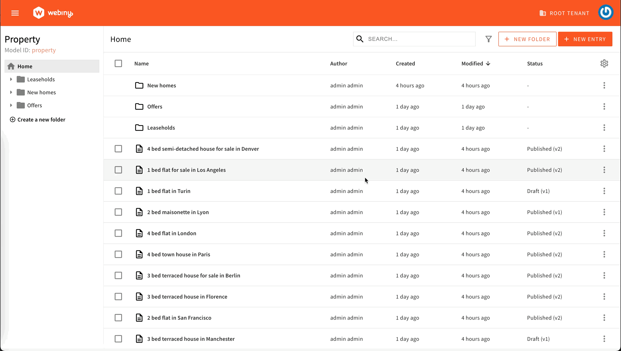
The Entry List Table is a UI component that displays entries for a specific CMS model. By default, the table shows pre-defined columns such as:
- Name: presenting the
titlefield data - Author: presenting the
createdByfield - Created: presenting the
createdOnfield - Modified: presenting the
savedOnfield - Status: presenting the
statusandversionfields
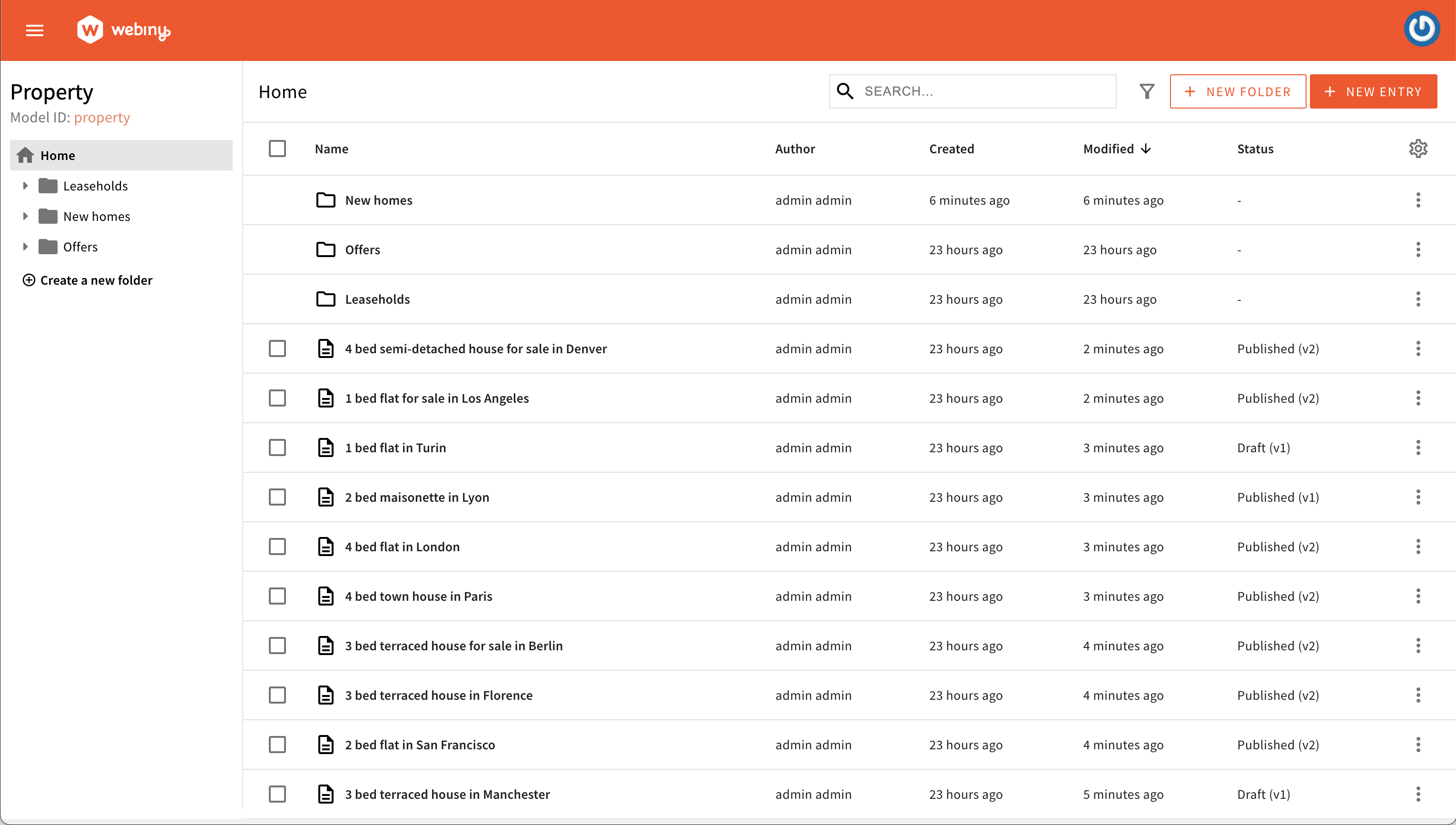 Default table columns
Using the Code Examples
The following code examples follow our usual configuration pattern. You need to add the code from the examples to your apps/admin/src/App.tsx. Here’s an example:
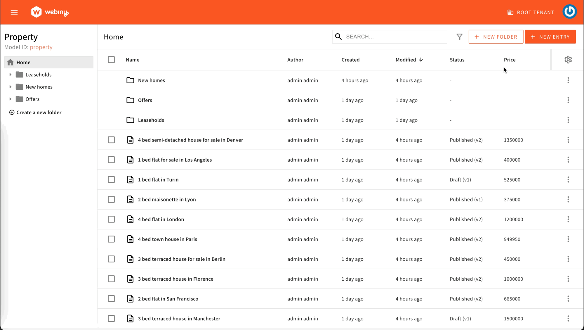
The code examples below are based on a content model called Property with the following fields:
titletext inputpricenumber inputcurrencytext input with ISO 4217 currency codes predefined values
Add a Column
To add a new column, use the Browser.Table.Column component and mount it within your Admin app. This component will serve as the foundation for your columns.
Simple Column
Here is an example of creating a column to show the price field data within the table.
The Browser.Table.Column component receives the following mandatory props:
nameused to target the field you want to show and serves as a unique identifierheaderused for formatting the column header
By declaring the modelIds prop, you can define in which Content Model Entry List you want to show your column. If you exclude this prop, the column will be registered for all models in the system. For instance, in the given example, next time you open the property content model, the newly defined column will be shown.
This is the whole process of registering a column.
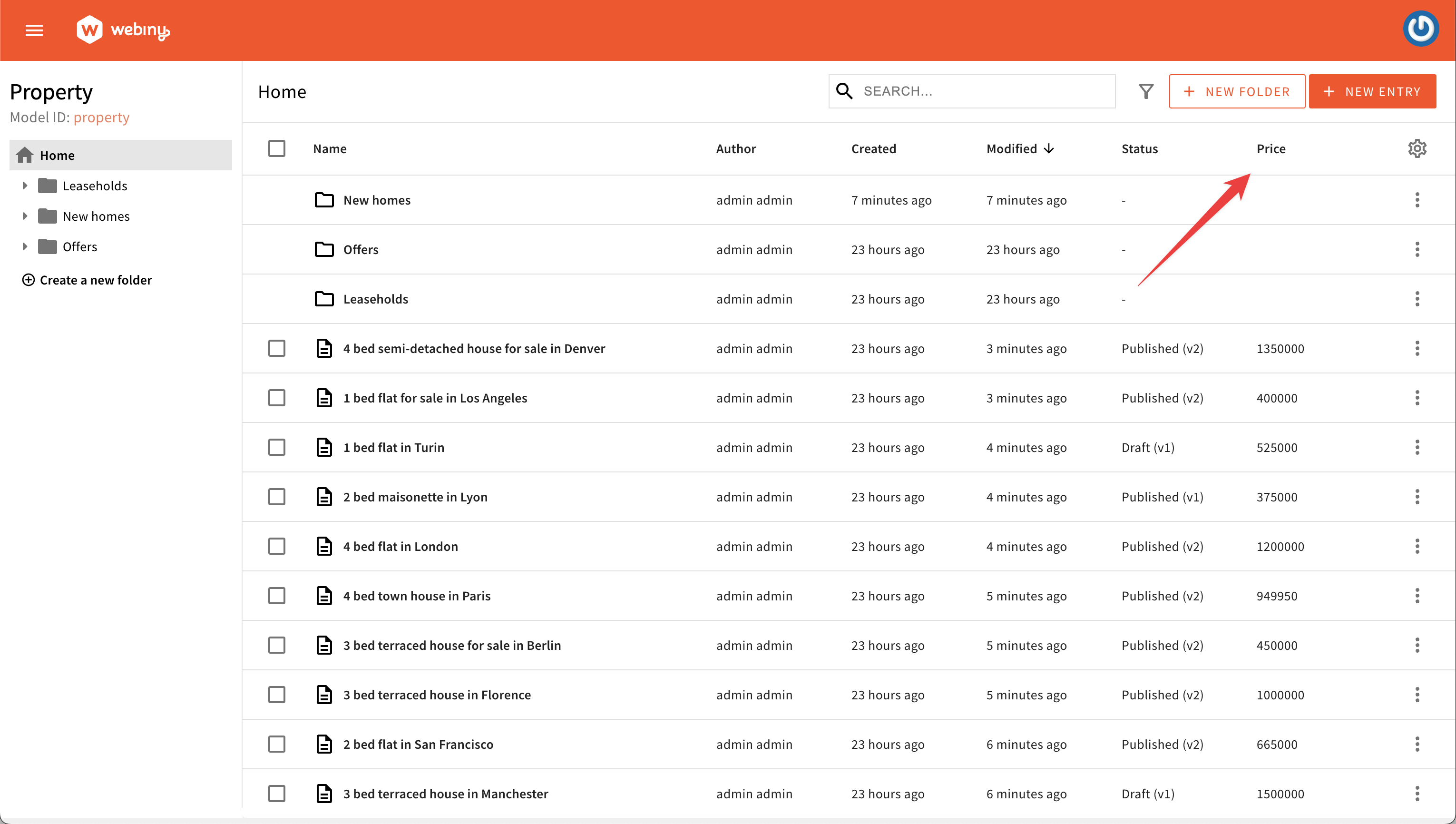 Define a simple custom column
Custom Column Cell Rendering
Sometimes, you may want to modify how the data in a cell is displayed using a specific component. This allows you to have full control over how the information is presented.
For example, you could create a CellPrice component that shows a simple dash for folder rows and displays the price value along with the selected currency for content entries.
Using the cell prop, you can pass the custom component to the column definition.
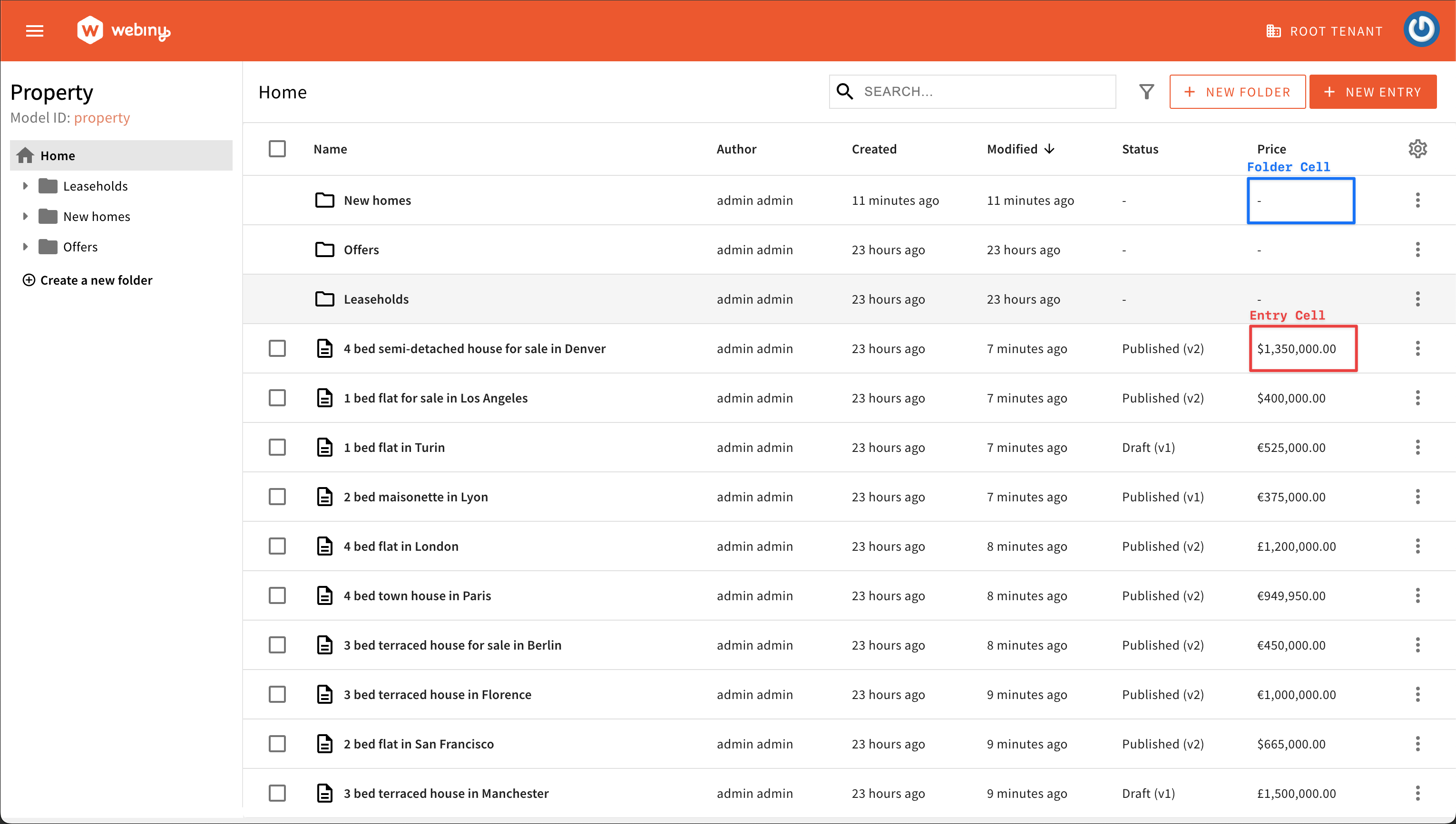 Define a custom cell renderer
Sortable Column
You can enable sorting by setting the sortable property, so users can sort the table by clicking on a column header. Make sure that the field you want to sort by is included in the available sorting options of the model.
 Define a sortable column
Custom Column Size
To set the initial size of a column, you can use the size property. By default, the size is set to 100.
However, this is not a value in pixels but more of a proportion with the other columns within the table. If you want to double the size of a specific column, you can pass 200 as the value.
In addition, you can allow or disallow users to adjust the column width according to their preferences by defining the resizable prop.
Custom Column Visibility
The visible property in data tables is crucial for user experience. By default, the column is visible to users. But, it can be set to hide by default, which is useful when dealing with large datasets.
Users have the ability to show/hide columns by using the column settings menu.
 Define column visibility
In addition to controlling the initial visibility of columns, you can further enhance user customization with the hideable feature.
When the hideable property is set to false, users are restricted from dynamically toggling the visibility of the column. In this scenario, the column remains fixed and visible, adhering to the configuration set by developers.
 Prevent users from toggling column visibility
Custom Column Class Names
You can easily add custom CSS class names to columns using the className property. The class names provided will be injected in both the column header and cell.
Discover Columns
This section demonstrates how you can discover the names of existing columns. This is important for further sections on positioning, removing, and replacing columns.
The easiest way to discover existing columns is to use your browser’s React Dev Tools plugins and search for the BaseColumns:
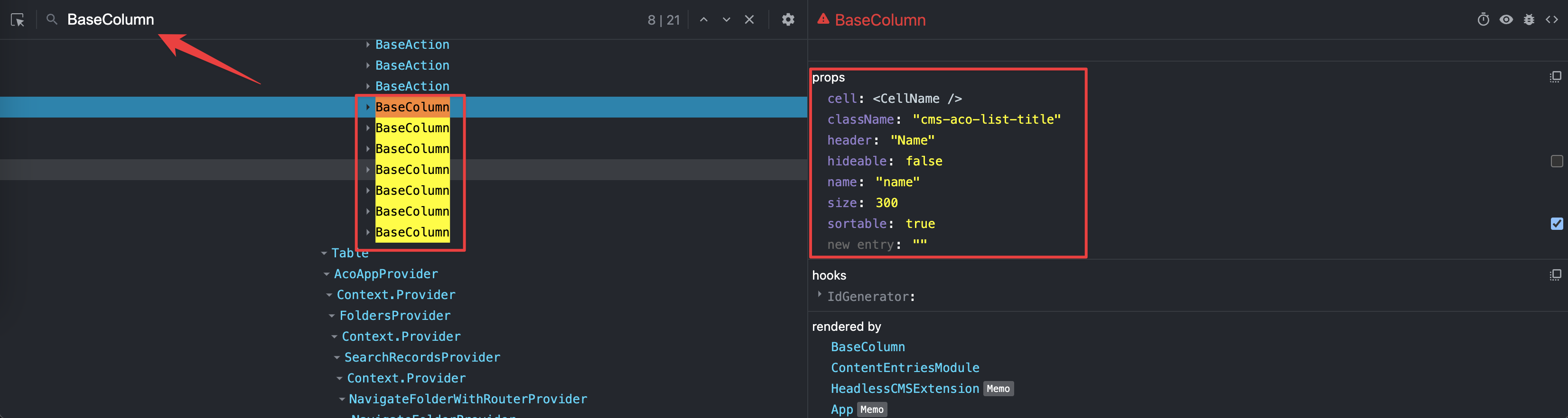 Discover existing columns
Position a Column
To position your column before or after an existing column, you can use the before and after props on the <Browser.Table.Column> element:
Remove a Column
Sometimes you might want to remove an existing column. All you need to do is reference the column by name and pass a remove prop to the <Browser.Table.Column> element:
Replace a Column
To replace an existing column with a new cell renderer, you need to reference an existing column by name and pass a new component via the cell prop: